I’ve been accused sometimes of burying the lead in my blogs, so let me lay this out right up front. There is a big difference between light and heat. Light, or data, so long as it’s accurate, provides insight into the truth of a situation or phenomenon. Heat — the negative consequences of an undesirable truth — generates a lot of fear, so people get unnecessarily skittish around negative data. But sometimes light leads to celebration. And, almost always, it leads to change. Our goal shouldn’t be to avoid spreading light, but to avoid generating heat, particularly when it isn’t needed.
Institutions like to proclaim themselves “data driven.” Further, institutions suggest that they use data to make decisions, and that decision-making is therefore highly rational. But it’s not. Organizations — and the individuals that populate them — behave very differently when actually presented with data. People see themselves in the data: they take it personally. And when that happens, rationality goes out the window.
The problem isn’t the people in the organization, however. In fact, people are the number one resource when problems need to be solved. The problem is a lack of habitus.We talk data, but we don’t actually do it. There is no practice. Few know the answers to basic questions about enrollment, retention, persistence and completion in their own programs, let alone the institution. Few collect data consistently and actually look at it, identifying areas for concern or celebration. Finally, while many talk about data, the act of showing it generates a good deal of trepidation and fear no matter the intent. I have seen the same reaction each time I attempt to use data to support a discussion, whether it is with administrators, students, or faculty. First, the person or group is deeply concerned and I can almost see the thought bubble above their head…”am I being measured?” Shortly thereafter, concern gives way to interest in what the data actually says followed by either elation or dread. If the latter, an immediate effort comes to try to discredit the data or ignore it. (Usually people don’t mind the data when it leads to celebration.) Organizations that are comfortable with looking at data — that practice using it daily– have taken the biggest step forward in efforts to improve, even if there is no effort to “fix” anything. Like a 12 step program, the first step is seeing the truth before any additional activity can happen. And the subsequent steps may need no shepherding at all — because people see what they need to do, they simply do it.
Consider the following three examples of real organizational data and what they tell us.
Figure One is part of a Level 2 Enrollment Scorecard based the ten day enrollment census. Each column shows the percent change from Fall to Fall (2008 to 2009, 2009 to 2010,….).Green is positive enrollment, yellow is less than the predicted 5% decline, and red is greater than 5% decline. What does the data tell us? At first glance, one might be alarmed by declines in enrollment but they are across the board. Is someone failing to manage or recruit or is something greater than the institution afoot? Patterns can tell us a lot, and disarm fears. Larger economic trends lead to enrollment behaviors beyond individual programs as clear from this data.
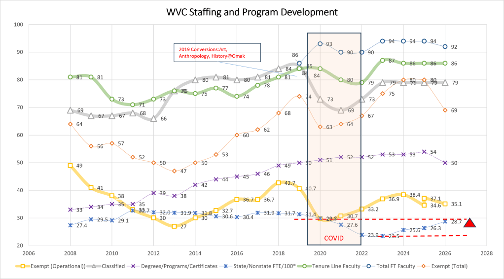
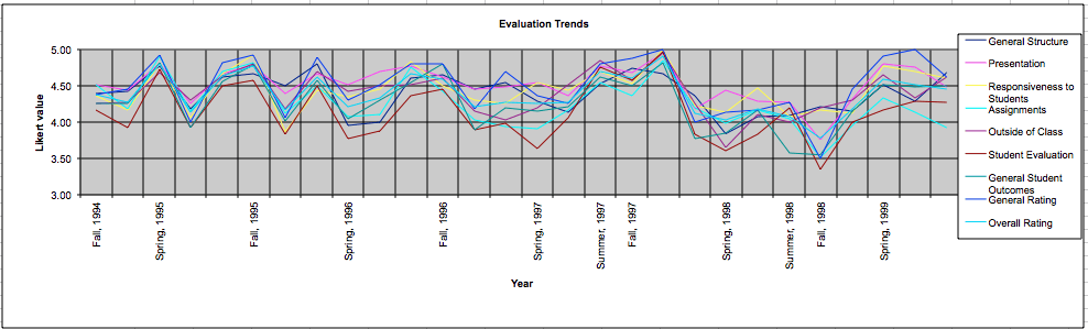
Figure Two. Faculty initiated longitudinal tracking from a Learning Feedback System (featured image) is tracked data from student responses to a Learning Feedback System. One can do a lot with data like this but two things are most noteworthy. The faculty member tracked this him or her self, not the institution…but the institution did need to provide the instrument and process. And the results provide opportunity for discussion. Can anyone see when my first son was born? (Oops, I guess I gave away the identity). At any rate, the trends are useful not just to establish an overall pattern and consistency but to look for changes when a faculty member tries something novel — like the use of a lectureless peer group problem based approach in Che 201. The results are in the data….well, at least the students attitudinal results are.
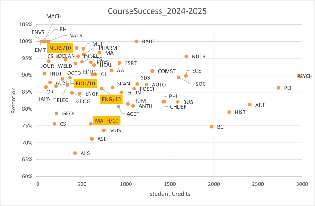
Finally, Figure Three shows some retention data by course prefix. Now some of you are getting nervous aren’t you. Remember, data sheds light, not explanation. And the explanation, the dialogue, the reflection all matter to moving an institution forward. Some courses have inherently low retention; others don’t. But how many even have an idea as to course retention in particular disciplines? We ALL should and we should all be working together to get better. Shining “light” on a phenomenon is never bad, unless it is accompanied by heat and effective administration goes to great pains to avoid heat whenever possible.
Faculty and staff asked to look at data often respond like they’ve just heard the words of Blue Oyster Cult when they sang, “Don’t fear the data, baby, take my hand…” and it is administration’s responsibility to create assurances regarding process and use so that the light can be the focus…not the fear of heat.
So I asked a faculty member…why is there so much fear of heat? The response:
What it boils down to is that faculty have no broad view of how they are doing. They don’t have ready access to that information. I can’t tell you what my personal retention rates are without asking for a favor from [an institutional researcher]. So I don’t have my own data and even if I did, I have no basis for comparison. I don’t know my grade or the grading scale. That’s a pretty scary position to be in. So what is the defense? I do what I can to keep [administrators] the hell away from my numbers? Stick my head in the sand? I can’t ask anyone in the class because they don’t know either.
The faculty member went on to say that part of the problem is that the kinds of data, sources of data, and analysis of the data are always coming from administration. S/he’s right. When faculty and staff are “flying blind,” the data can be scary. For the moment, at my institution at least, we have neither the capacity nor the data literacy to completely “open source” but imagine what an organization like that might be like.
An organization flush with transparent data that individuals and groups can access on their own, who ask questions and seek answers on their own, might find that the need for administrators actually goes down. A sandbox of data available to faculty and staff for their own exploration…like the Learning Feedback System…could generate a ton of positive results as faculty explored on their own information about their own teaching. Many of the results — or at least the changes and means leading to them — might be unseen to the outside world (meaning administration). But they would be seen to the students, and the faculty would feel the positive vibe of student response…and that is our ultimate aim anyway.
First published May, 2012.


Leave a Reply